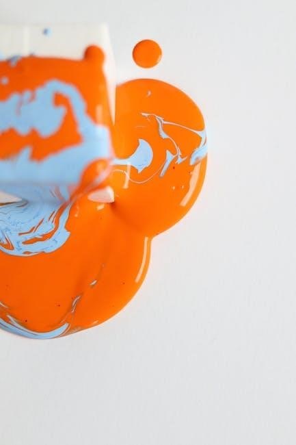
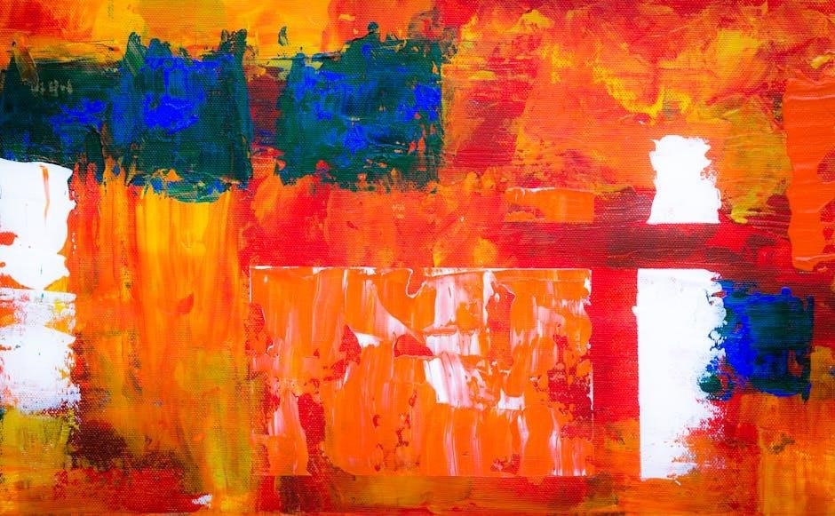
Acrylic color mixing unlocks vibrant, versatile creative possibilities. Mastering the basics of color theory and practical exercises is essential. Start by understanding primary and secondary colors, then explore mixing techniques. Use a color wheel as your guide to achieve desired hues and effects. Experiment with ratios and tools to enhance your artistic expression.
1.1 Understanding the Basics of Color Theory
Color theory forms the foundation of effective acrylic mixing. It begins with the color wheel, which organizes colors into primary (red, yellow, blue), secondary (orange, green, violet), and tertiary hues. Primary colors cannot be created from others, while secondary colors are derived from mixing two primaries. Tertiary colors result from combining primary and secondary colors. Understanding warm (red, orange, yellow) and cool (blue, green, violet) colors helps in creating mood and balance. The 60-30-10 rule for color harmony is also vital, guiding the distribution of dominant, secondary, and accent colors. These principles empower artists to predict and control color interactions, ensuring acrylic mixes achieve the desired visual impact.
- Primary colors: Red, Yellow, Blue
- Secondary colors: Orange, Green, Violet
- Warm vs. Cool colors
1.2 Importance of a Color Mixing Guide
A color mixing guide is indispensable for acrylic artists, serving as a roadmap to predict and achieve desired hues. It helps streamline the mixing process, saving time and reducing paint waste. By documenting color ratios and combinations, artists can maintain consistency across projects. A guide also enhances creativity, allowing for systematic exploration of color possibilities. Over time, it becomes a personalized reference, reflecting an artist’s unique style and preferences. This tool is especially valuable for acrylics, which dry quickly, making real-time adjustments challenging. A well-organized guide empowers artists to work efficiently, ensuring their vision is realized with precision and confidence.
- Streamlines the mixing process
- Saves time and reduces waste
- Enhances creativity and consistency
The Color Wheel and Its Role in Mixing
The color wheel is a fundamental tool for understanding color relationships. It organizes hues in a circular format, showing primary, secondary, and tertiary colors. This structure helps predict mixing results, enabling artists to create harmonious palettes and achieve desired effects. By studying the color wheel, painters can master color harmony and theory, essential for acrylic mixing. It also reveals warm and cool color biases, guiding artists in evoking specific moods and effects in their work.
2.1 Primary Colors and Their Significance
Primary colors—red, yellow, and blue—are the foundation of color mixing. They cannot be created by mixing other colors and are essential for producing secondary and tertiary hues. Red, yellow, and blue serve as the base for the color wheel, enabling artists to mix a wide range of colors. Understanding their properties is crucial for achieving accurate color mixing. For example, mixing equal parts of red and yellow creates orange, while blue and yellow produce green. These colors also have warm and cool biases, influencing the overall feel of a painting. By mastering primary colors, artists can build a solid framework for creating complex color palettes and achieving desired visual effects in their acrylic work.
2.2 Secondary Colors and How They Are Derived
Secondary colors—orange, green, and violet—are created by mixing two primary colors. Orange is made by combining red and yellow, green by mixing blue and yellow, and violet by blending blue and red. These colors are fundamental in expanding the color palette and adding depth to artworks. Understanding how to derive secondary colors is essential for acrylic painters, as it allows for the creation of harmonious color schemes. For instance, mixing equal parts of red and yellow produces a vibrant orange, while adjusting the ratios creates different shades. Secondary colors also play a key role in color theory, enabling artists to explore a wide range of hues and effects in their compositions. They serve as a bridge between primary colors and more complex tertiary shades.
2.3 Tertiary Colors and Their Applications
Tertiary colors are created by mixing a primary color with a secondary color, resulting in hues like yellow-green, blue-green, blue-violet, red-violet, red-orange, and yellow-orange. These colors add complexity and depth to artworks. They are particularly useful for creating subtle variations in landscapes, portraits, and still-life compositions. Tertiary colors can also enhance the emotional impact of a piece by introducing nuanced shades. Artists often use them to create soft transitions and layered effects. For example, yellow-green can add warmth to foliage, while blue-violet can deepen shadows. By experimenting with tertiary colors, painters can achieve rich, dynamic palettes that elevate their work. These colors are essential for capturing detailed textures and moods in acrylic painting.
2.4 Warm and Cool Colors: Understanding Bias
Warm colors, such as oranges and reds, evoke energy and warmth, while cool colors like blues and greens create calmness. The bias of a color refers to its leaning toward warmth or coolness. For example, a blue can have a green bias (cool) or a purple bias (warm). Understanding this helps in mixing vibrant or muted tones. Warm colors advance in a composition, while cool colors recede, creating depth. Mixing warm and cool colors can achieve balance and contrast. Artists use this principle to guide the emotional impact of their work. Experimenting with bias allows for nuanced color combinations, enhancing the expressive potential of acrylic painting. This understanding is crucial for creating dynamic and harmonious artworks.
Practical Exercises for Mastering Color Mixing
Practice creating a comprehensive color chart to explore primary and secondary color combinations. Step-by-step mixing exercises help build confidence in achieving desired hues and understanding color ratios effectively.
3.1 Creating a Comprehensive Color Chart
A color chart is a foundational tool for mastering acrylic color mixing. Begin by selecting a range of primary colors, including both warm and cool versions. On a sheet of canvas paper, create a grid with each color along the top row and side. This setup allows for systematic mixing. Start by combining each primary color with others to produce secondary hues. Document the ratios used to achieve each shade, ensuring consistency. Expand the chart by introducing tertiary colors and exploring warm and cool biases. This exercise not only enhances your understanding of color relationships but also serves as a valuable reference for future projects. Regularly updating your chart will refine your mixing skills and save time during creative sessions.
3.2 Step-by-Step Guide to Mixing Primary and Secondary Colors
Begin by mixing primary colors (red, yellow, blue) to create secondary colors. Mix equal parts red and yellow to make orange. Combine yellow and blue for green, and blue and red for violet. Start with a 1:1 ratio for consistency. Use a palette or mixing surface and blend thoroughly. For lighter shades, add white; for darker tones, incorporate black or the complementary color. Experiment with warm and cool variations by adjusting the proportions of primary colors. Document each mix in your color chart for future reference. This process builds a solid foundation for understanding color relationships and enhances your ability to create harmonious hues in acrylic painting. Practice regularly to refine your technique and explore endless creative possibilities.
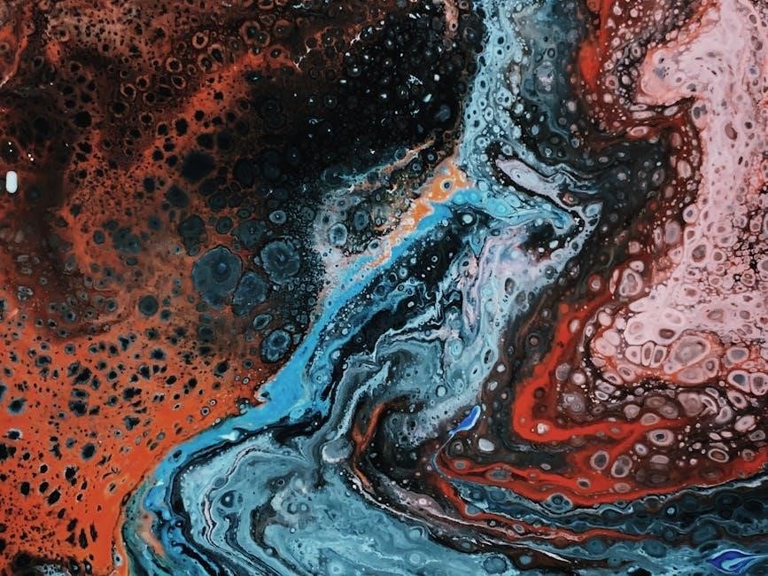
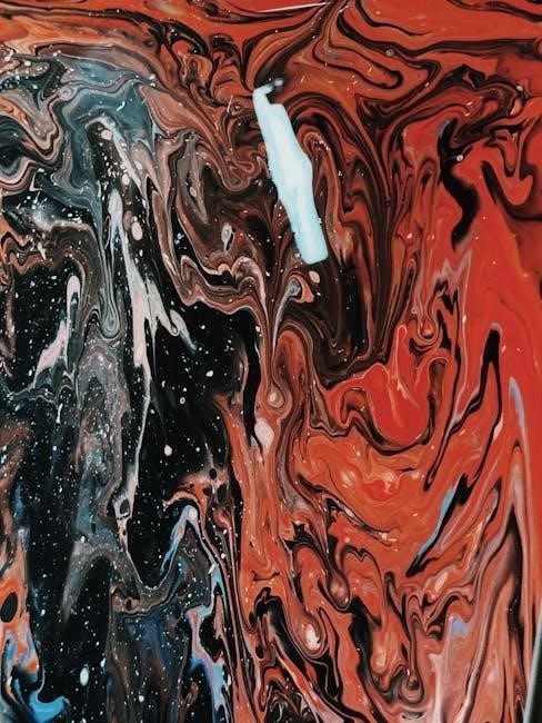
Essential Color Mixing Techniques
Master optical mixing, glazing, scumbling, and wet-on-wet techniques to enhance your acrylic works. These methods create depth, texture, and vibrant effects, expanding your artistic possibilities.
4.1 Optical Mixing: Creating Colors Through Perception
Optical mixing is a technique where colors appear to blend through visual perception rather than physical mixture. By placing small, distinct dots or strokes of pure color side by side, the viewer’s eye mixes the hues, creating vibrant, shimmering effects. This method is ideal for achieving bright, luminous colors that retain their intensity. Unlike traditional mixing, optical mixing preserves the individual pigments’ energy and clarity. Artists often use this technique to capture light and movement in their work. Experiment with contrasting warm and cool colors to enhance the effect. Practice this method to add dynamic, lifelike qualities to your acrylic paintings, ensuring each piece feels alive and full of energy. Optical mixing opens up new dimensions of creativity and visual impact in your art.
4.2 Glazing: Achieving Deep, Rich Colors
Glazing is a powerful technique for achieving deep, rich colors in acrylic painting. It involves applying multiple thin, transparent layers of paint over a base coat. By mixing acrylics with mediums like matte medium or gloss medium, you create a translucent effect. This method allows for remarkable depth and luminosity, as each layer builds upon the previous one. Glazing is particularly effective for creating complex shadows, realistic skin tones, and atmospheric effects. To master glazing, work slowly, allowing each layer to dry before adding the next. This technique is ideal for capturing subtle shifts in color and light, making it a favorite for landscape and portrait artists. With patience and practice, glazing can elevate your work, adding dimension and richness to your acrylic paintings. It’s a versatile method that enhances both color intensity and visual impact. Always experiment with different layering techniques to achieve the desired effect.
4.3 Scumbling: Layering for Textured Effects
Scumbling is a versatile acrylic technique that involves layering paint to create textured, dimensional effects. By applying a thin layer of opaque or semi-opaque paint over a previously painted surface, you can achieve intricate patterns, rough textures, or even correct areas of your work. This method is particularly effective for adding visual interest to backgrounds, creating organic forms, or mimicking natural surfaces like stone or wood. To scumble, use a drybrush or palette knife to apply paint in quick, gestural strokes. Allow each layer to dry before adding more, as this ensures crisp, defined textures. Experiment with different paint consistencies and tools to vary the effects. Scumbling is a dynamic way to add depth and tactile appeal to your acrylic paintings, making it ideal for abstract and mixed-media works. It’s a technique that encourages spontaneity and exploration, allowing you to transform flat surfaces into engaging, three-dimensional experiences. Always test your tools and paint on a separate surface before applying them to your final piece. This approach helps you achieve the desired texture without compromising your artwork. With practice, scumbling becomes a powerful tool for enhancing your creative expression. It’s especially useful for capturing the essence of natural elements or creating abstract compositions. By layering paint in this way, you can add complexity and visual intrigue to your work, making it stand out. Whether you’re working on a landscape, portrait, or abstract piece, scumbling offers endless possibilities for adding texture and depth. It’s a technique that bridges the gap between painting and mixed media, allowing you to explore new creative territories. Always remember to work patiently, as building up layers takes time but yields remarkable results. Scumbling is a testament to the versatility of acrylics, proving that texture and color can coexist beautifully in a single piece. By mastering this technique, you can elevate your art, creating pieces that invite both visual and tactile engagement. It’s a method that rewards experimentation and creativity, making it a favorite among artists who enjoy pushing boundaries. With scumbling, the possibilities are endless, and the process is as rewarding as the outcome. Always keep a variety of tools on hand to explore different effects, and don’t be afraid to try something new. Scumbling is a technique that will expand your artistic horizons and add a new dimension to your work.
4.4 Wet-on-Wet: Blending Colors on the Canvas
Wet-on-wet is a dynamic acrylic technique that involves applying wet paint to a wet surface, allowing colors to blend seamlessly. This method is ideal for creating soft transitions, gradients, and subtle shifts in tone. Unlike traditional layering, wet-on-wet works best when the paint and surface are freshly applied, as the moisture enables the colors to merge naturally. Use a soft brush or palette knife to gently blend the edges of adjacent colors. This technique is particularly effective for capturing skies, water, and delicate floral patterns. However, it requires quick execution, as acrylics dry rapidly. To enhance control, work in small sections and maintain consistent moisture levels. Wet-on-wet is perfect for achieving fluid, organic effects that add movement and harmony to your artwork. It’s a great way to explore the expressive potential of acrylics, creating pieces that feel alive with color and energy. By mastering this technique, you can evoke emotions and moods through the subtlety of your blends. Wet-on-wet is a cornerstone of acrylic painting, offering endless opportunities to experiment with color and form. It’s a method that rewards spontaneity and precision, making it a valuable addition to your artistic toolkit. Always remember to plan your color palette in advance, as the rapid drying time of acrylics demands efficiency. With practice, you’ll achieve smooth, professional-looking blends that elevate your work. Wet-on-wet is a technique that bridges the gap between control and creativity, allowing you to craft intricate, visually stunning pieces. It’s a must-try for any artist looking to expand their creative horizons and push the boundaries of acrylic painting. By embracing the fluidity of wet-on-wet, you can create artworks that are both delicate and powerful, capturing the essence of your vision with ease. This technique is a testament to the versatility of acrylics, proving that with the right approach, even the most challenging effects can be achieved. Always keep experimenting and exploring new ways to apply wet-on-wet, as it offers a wealth of creative possibilities. Whether you’re painting landscapes, portraits, or abstracts, this technique will add a new dimension to your work, making it stand out. Wet-on-wet is a powerful tool in the hands of any artist, and mastering it will take your acrylic paintings to the next level.
The Role of Black and White in Color Mixing
Black and white are essential for adjusting color depth, contrast, and tone. Use black to deepen hues and white to create tints, enhancing your palette’s versatility and expressive potential.
5.1 Tinting: Adding White to Colors
Tinting involves adding white to a color to create lighter, softer shades. This technique is ideal for reducing color intensity and achieving pastel hues. When tinting with acrylics, start by adding small amounts of white to your base color, gradually building up to the desired lightness. This method is particularly useful for creating delicate skin tones, soft landscapes, or subtle gradients. Remember, white can also alter the color’s temperature, so observe how it affects warm and cool tones. Documenting your tinting process in a color chart helps maintain consistency; Always mix on a clean palette to avoid contamination and ensure precise results. Tinting is a versatile tool for enhancing your artistic expression and expanding your color palette.
5.2 Toning: Mixing with Gray
Toning involves mixing a color with gray to reduce its intensity and create a more balanced hue. Gray, made by combining black and white, softens vibrant colors without fully neutralizing them. This technique is ideal for achieving subtle, nuanced shades in acrylic painting. When toning, start by adding a small amount of gray to your base color and gradually adjust to reach the desired tone. Toning is particularly useful for creating calm, serene effects in landscapes or portraits. It allows artists to mute bold colors while retaining their essence, enhancing the overall harmony of a piece. Experiment with different gray ratios to discover how toning can transform your color palette and add depth to your artwork.
5.3 Shading: Incorporating Black for Depth
Shading with black adds depth and dimension to your artwork by creating shadows and enhancing contrast. Mixing black with colors darkens them, producing rich, dramatic tones. This technique is particularly effective for creating realistic shadows and adding volume to shapes. When incorporating black, start with small amounts to avoid overpowering the original color. Gradually build up the shade to achieve the desired intensity. Shading is essential for creating three-dimensional effects in acrylic painting, making objects appear more lifelike. By carefully balancing black with other hues, you can add sophistication and depth to your compositions without losing the vibrancy of your palette. This method is especially useful in portrait and landscape painting to create striking visual effects.
Mixing Specific Colors and Shades
Mixing specific colors and shades in acrylics requires precision and practice. From skin tones to neutrals, explore techniques to create vibrant and subtle hues tailored to your artistic vision.
6.1 Mixing Skin Tones: A Detailed Guide
Mixing realistic skin tones in acrylics involves blending warm and cool colors. Start with a base of Burnt Sienna and Yellow Ochre, adding touches of Titanium White for brightness. Adjust tones by introducing Cadmium Red for warmth or Ultramarine Blue for cooler undertones. For deeper skin tones, incorporate Sepia or Raw Umber. To achieve lighter shades, mix in more Titanium White or soft pinks. Experiment with glazing techniques to add depth and realism. Practice layering to capture subtle variations in skin color, ensuring natural transitions between hues. Document your mixes for consistency and future reference, as slight adjustments can significantly impact the final result. This process requires patience and observation to master the complexity of human skin tones effectively.
6.2 Creating Neutral and Muted Colors
Neutral and muted colors are essential for adding depth and balance to your artwork. To create neutrals, mix complementary colors (e.g., blue and orange) to desaturate the hues. Add gray or white to mute vibrant tones. For warm neutrals, blend earth colors like Burnt Sienna and Raw Umber with a touch of white. Cool neutrals can be achieved by mixing blues and greens with gray. Experiment with layering and glazing techniques to enhance the subtlety of your colors. Practice creating a range of muted shades by adjusting the ratios of your mixes. Documenting your combinations ensures consistency and simplifies future projects. Mastering neutrals and muted tones will expand your palette and add sophistication to your acrylic pieces.
6.3 Mixing Bright and Vibrant Colors
Mixing bright and vibrant colors with acrylics requires careful selection of hues and techniques. Start with pure primary colors to maximize vibrancy. Use the color wheel to identify complementary colors that create vivid contrasts when mixed. To enhance brightness, add small amounts of white or light-colored pigments. Experiment with layering thin glazes to intensify colors without muddying them. Avoid overmixing, as it can dull the hues. Incorporate metallic or iridescent mediums for added luminosity. Practice creating color charts to explore combinations and ratios. Document your mixes to refine your approach. Vibrant colors can elevate your artwork, making it dynamic and visually striking. Mastering these techniques will help you achieve bold, eye-catching results in your acrylic projects.
Common Challenges in Acrylic Mixing
Acrylic mixing often poses challenges like overmixing and fast drying times. Address these by working quickly and using small batches. Maintain consistency and experiment patiently to achieve desired results.
7.1 Avoiding Muddy Colors: Tips and Tricks
Avoiding muddy colors in acrylic mixing requires careful planning and technique. Start by understanding color theory basics, such as the color wheel and pigment properties. Use small amounts of paint and mix gradually to maintain clarity. Begin with light layers and build up, allowing each layer to dry before adding more. This prevents overmixing, which can dull vibrant hues. Experiment with high-quality pigments, as cheaper paints may lack lightfastness and purity. Always test mixtures on a palette before applying them to your canvas. Keep a mixing chart to track ratios and results for future reference. Finally, consider using mediums like glazing liquids to enhance transparency and control. These strategies will help you achieve crisp, clean colors in your acrylic artworks.
7.2 Maintaining Color Consistency
Maintaining color consistency is crucial for achieving professional results in acrylic painting. Start by documenting your color recipes, noting the exact ratios of each pigment used. Create a personal color chart to track and replicate hues effectively. Work in small batches to ensure uniformity, especially when mixing large quantities. Use high-quality, lightfast pigments to avoid fading or color shifts over time. Consider the brand and specific formulation of your paints, as variations can affect consistency. To maintain vibrancy, avoid overmixing or adding too much medium, which can dilute the color. Finally, work in a controlled environment, as temperature and humidity can impact paint behavior. By following these steps, you can ensure your colors remain consistent and true throughout your artistic process.
Advanced Techniques for Color Mixing
Explore advanced methods like using mediums to enhance colors and incorporating metallic or iridescent pigments. These techniques expand creative possibilities and achieve unique visual effects in acrylic art.
8.1 Using Mediums to Enhance Color
Acrylic mediums are powerful tools to enhance and transform colors in your artwork. By incorporating mediums like glazing liquids, texture pastes, or matte agents, you can achieve unique visual effects. Glazing mediums, for instance, allow for translucent, deep layers of color, while texture pastes add dimensional interest. Mixing mediums with paint can also alter its consistency and light-refracting properties. For example, using a matte medium can reduce the shine of vibrant colors, creating a softer, more subdued appearance. Additionally, mediums can help maintain color vibrancy by preventing muddy mixtures. Experimenting with different mediums enables artists to explore new creative possibilities and achieve complex, dynamic color effects in their work. This technique is especially useful for creating rich, multi-layered pieces with depth and dimension.
8.2 Exploring the Use of Metallic and Iridescent Colors
Metallic and iridescent colors add a luxurious, eye-catching dimension to acrylic artworks. These specialized pigments reflect light uniquely, creating dynamic, shimmering effects. Metallic colors, such as gold, silver, and copper, can be mixed with other hues to enhance warmth and depth. Iridescent colors, on the other hand, shift their appearance based on the viewing angle, offering a mesmerizing, multi-tonal effect. To incorporate these colors, artists often use specific mediums like metallic acrylic paints or iridescent powders. Layering techniques, such as glazing, can amplify their impact. Experimenting with these colors allows for the creation of striking, otherworldly effects that captivate the viewer. They are particularly effective in abstract pieces, fantasy art, and decorative designs, adding an extra layer of visual intrigue and sophistication to any composition.
Tools and Resources for Effective Mixing
A color wheel is indispensable for visualizing color relationships. A personal color mixing chart and high-quality palettes enhance precision. Additional tools like mediums and reference guides further optimize the mixing process.
9.1 The Importance of a Color Wheel
A color wheel is a fundamental tool for acrylic artists, offering a visual representation of color relationships. It organizes hues into primary, secondary, and tertiary categories, simplifying the mixing process. By understanding how colors interact, artists can predict mixing outcomes, identify complementary and analogous colors, and create harmonious palettes. The color wheel also aids in achieving color consistency and exploring warm and cool tones. Many artists use it to plan compositions and experiment with new shades. Its versatility makes it an essential resource for both beginners and experienced painters, ensuring accurate and intentional color mixing in every project.
9.2 Creating a Personal Color Mixing Chart
A personal color mixing chart is a invaluable resource for acrylic artists, allowing them to track and replicate specific hues. Start by selecting primary colors, including both warm and cool versions, and arrange them in a grid on canvas or paper. Each color is placed along the top and side, creating intersections where mixtures are painted. Document the ratios of each color used to achieve specific shades, ensuring consistency. Over time, this chart becomes a personalized guide, helping to understand color relationships and avoid redundant experimentation. Regularly updating the chart with new discoveries enhances its usefulness. It’s a practical tool that evolves with your artistic journey, providing a reliable reference for future projects.
Mastering acrylic color mixing is a journey of experimentation and creativity. By practicing techniques and creating a personal guide, artists can unlock endless possibilities. Keep exploring, experiment boldly, and refine your skills to achieve stunning results in your artwork.
10.1 Summarizing Key Concepts
Acrylic color mixing is rooted in understanding the color wheel and theory. Primary colors form the base, while secondary and tertiary colors expand creative possibilities. Techniques like glazing, scumbling, and wet-on-wet add depth and texture. Black and white are essential for shading, toning, and tinting. Consistency in ratios ensures reproducibility, and creating a personal color chart aids in future projects. Practice is vital to mastering these skills, allowing artists to experiment and innovate. By combining theory with practical application, artists can achieve desired effects and explore endless creative possibilities in their work.
10.2 Encouraging Continued Practice and Experimentation
Consistent practice and experimentation are key to mastering acrylic color mixing. Start by creating a color chart to track your mixes, ensuring reproducibility. Use the color wheel as a guide to explore relationships between hues. Experiment with techniques like glazing, scumbling, and wet-on-wet to achieve unique effects. Don’t be afraid to try unconventional combinations—surprising results can inspire new ideas. Tracking your progress in a journal helps identify patterns and improvements. Embrace challenges as opportunities to learn, and remember, every mix is a step toward artistic growth. The more you practice, the more confident you’ll become in creating custom colors and achieving your vision. Keep exploring, and enjoy the creative journey of color mixing!